Open your own website on your phone right now. If you have to zoom in, scroll sideways, or squint just to read a sentence, you already know the problem.
This is the reality for many WordPress sites that were built without true responsiveness in mind. And on today’s internet, that’s not just a design flaw. It’s a growth blocker.
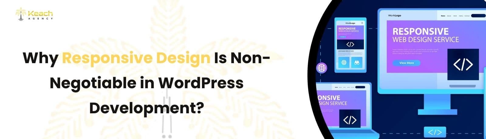
A responsive site is no longer a “nice touch.” Responsive design in WordPress is the foundation of how users experience your brand, how search engines judge your site, and how likely visitors are to stay, trust you, and take action. Most users won’t tell you your site feels bad. They’ll just leave.
Is your WordPress website actually working on mobile?
KeachAgency audits WordPress UX and fixes responsiveness before it costs traffic.
How User Behavior Forced This Shift
People don’t browse like they used to. They switch devices constantly. Phone in the morning. Laptop at work. Tablet at night. A WordPress responsive website adapts to all of it. Automatically. Smoothly.
Without a mobile-friendly WordPress design, layouts break. Buttons shrink. Text becomes hard to read. Forms turn frustrating. And frustration is where trust disappears.
This is why Google now evaluates sites through mobile-first indexing. It looks at how your site behaves on smaller screens first, not on desktop. If your mobile experience is weak, your rankings feel it, even if your desktop site looks fine.
Responsive design in WordPress is not about trends. It’s about matching real user behavior.
What Responsive Design Really Means (And What It Doesn’t)
Responsive design is often misunderstood. It does not mean your site “opens” on a phone.
It means your site adjusts intelligently to screen size, orientation, and user behavior.
A proper WordPress responsive website:
- Resizes text without breaking layout.
- Keeps navigation easy to tap.
- Loads fast on mobile data.
- Maintains visual hierarchy.
- Feels natural to scroll.
This directly impacts WordPress website UX. When users feel comfortable, they stay longer. When they stay longer, search engines notice.
The SEO Cost of Ignoring Responsiveness
Poor responsiveness doesn’t fail loudly. It fails quietly.
You might see:
- Higher bounce rates.
- Lower time on page.
- Fewer form submissions.
- Slower ranking growth.
Google tracks all of this.
A mobile-friendly WordPress design improves:
- Crawlability.
- Page speed signals.
- Engagement metrics.
- Conversion paths.
Search engines want to rank sites that help users. If your site creates friction on mobile, it sends the opposite signal. This is why modern WordPress development services starts with responsiveness, not finishes with it.
Where Most WordPress Sites Go Wrong
Here’s what commonly breaks responsiveness:
These problems compound over time. What starts as a small UX issue turns into traffic loss.
Responsiveness and Trust Go Hand in Hand
Users judge credibility in seconds. If a site feels clunky on mobile, people assume:
- The business is outdated.
- Support may be weak.
- Payments might not be secure.
That’s harsh, but it’s real.
A clean WordPress responsive website builds instant confidence. Smooth scrolling. Clear buttons. Easy reading. These details signal professionalism without saying a word. This is where WordPress website UX becomes a trust signal, not just a design choice.
Not sure what’s hurting your mobile experience?
KeachAgency identifies UX gaps in WordPress sites and fixes them properly.
Responsive Design Supports Long-Term Growth
Responsive design services in WordPress are scalable. As your content grows, products expand, or traffic increases, responsiveness keeps the experience stable. You’re not constantly patching layouts or redesigning pages.
In solid WordPress development, responsiveness is baked into:
- Theme structure.
- CSS breakpoints.
- Flexible grids.
- Performance optimization.
This reduces maintenance, improves consistency, and protects rankings over time.
What a Healthy Responsive WordPress Site Looks Like
A well-built site:
- Feels the same on every device.
- Loads fast without shortcuts.
- Keeps content readable.
- Makes actions easy to take.
Users don’t notice responsiveness when it’s done right. They just feel comfortable. That comfort is what turns visits into leads.
Final Thoughts
Responsive design is not a trend that fades. It’s the baseline expectation.
Every update in search, every shift in user behavior, and every new device push responsive design in WordPress deeper into necessity. Sites that ignore it don’t fail overnight. They slowly lose relevance.
Strong WordPress development starts with users, not layouts. When your site respects how people browse, it earns their time, trust, and action. That’s what makes responsiveness non-negotiable.
Is your WordPress site built for real users, not just screens?
KeachAgency designs mobile-first WordPress experiences that convert.
FAQs
What is responsive design in WordPress?
It means designing a WordPress site that automatically adjusts layout, content, and functionality across all screen sizes for a smooth user experience.
Why is a WordPress responsive website important for SEO?
Search engines prioritize mobile usability. Responsive sites perform better in rankings due to improved engagement and mobile-first indexing.
Does responsive design improve WordPress website UX?
Yes. It reduces friction, improves readability, and makes navigation easier, which keeps users engaged longer.
Is a mobile-friendly WordPress design different from a responsive design?
Mobile-friendly focuses on basic usability, while responsive design adapts fluidly across all devices and screen sizes.
Can old WordPress sites be made responsive?
Yes. Through theme updates, layout adjustments, and performance optimization, older sites can be upgraded without full rebuilds.
