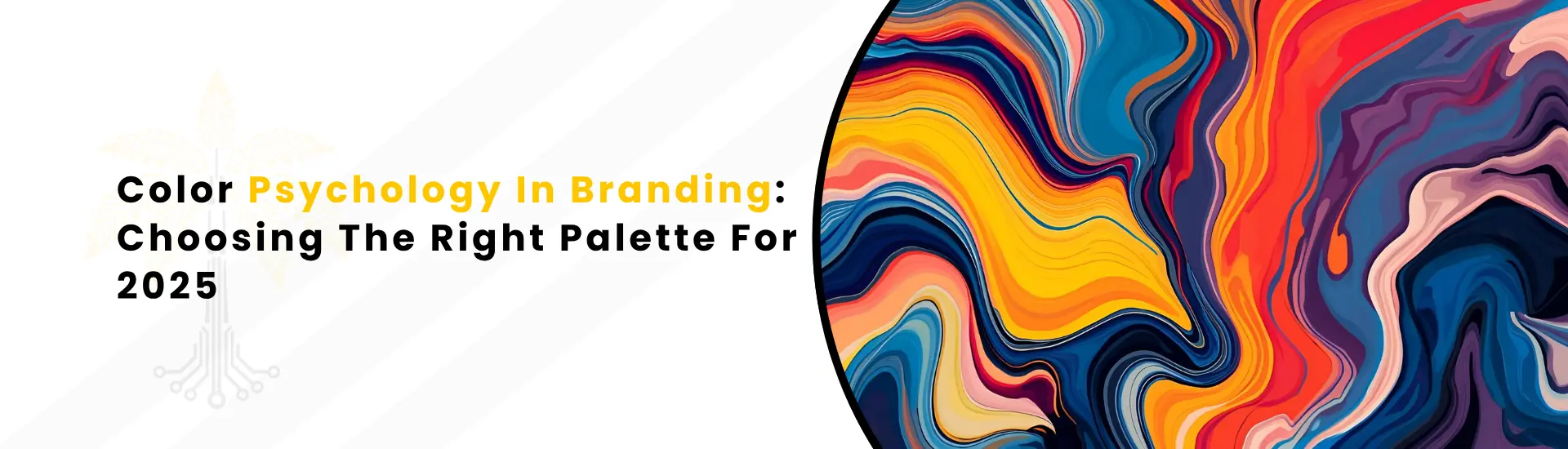
Branding in 2025 is basically a battle for attention, and color is your secret weapon. Seriously, forget boring logos or those painfully forced taglines. If your brand colors are off, people will bounce fast. But if you nail the palette? You get that “love at first sight” effect, the kind where customers feel like your brand is speaking their language without saying a word.
COLOR PSYCHOLOGY: WHY IT’S THE REAL MVP
Okay, so, color psychology isn’t just some artsy theory designers throw around. It’s this low-key superpower, all about how color messes with our emotions and decision-making, usually without us even noticing. Like, why do we trust a bank that’s decked out in blue? Why does that giant red “SALE” make us feel like we’ll miss out unless we click? It’s not magic, it’s science, and it’s the foundation of any solid visual identity.
Look at Coca-Cola: they own that red color. It’s not just about standing out, it’s about energy, excitement, and, let’s be real, making you thirsty. Meanwhile, banks and tech companies bathe in blue because blue = trust + stability + “we won’t lose your money.”
But here’s where it gets wild: the same color can mean totally different things depending on where you are. Red is lucky in China, but in the UK, it might just remind you of traffic tickets. That’s why you can’t just Google “best brand color” and call it a day. You need to build a palette that actually connects, and that’s where a creative branding agency comes in.
HOW COLOR SHAPES BRANDING
Let’s be honest, brand colors are a vibe check for your brand. People pick up on your mood before you say a single word. Want to seem chill and welcoming? Hit them with soft greens and blues. Trying to get people pumped? Go bold with orange or red. It’s like setting the playlist for a party, playing the wrong song, and everyone leaves early.
But that’s just the beginning. Color also:
- Makes your brand sticky, like people actually remember you because your colors pop in their brain (“Oh yeah, those guys with the mint green packaging!”)
- Keeps your whole look tight across everything, website, app, packaging, TikTok, you name it
- Reinforces your vibe: Are you fancy, playful, eco-friendly, techy? Your colors scream it before you even open your mouth.
If you’re building a balanced visual identity, this isn’t optional; it’s foundational.
2025 COLOR TRENDS: THE PLAYBOOK
MOOD SWINGS
Static palettes are out, adaptive palettes are in. Brands aren’t sticking to just one set of colors anymore; they’re mixing it up depending on where you see them and what’s happening. Like, a wellness app might go all earthy and calm for the default, but when there’s a promo? Suddenly, you get a splash of warm palette to nudge you to sign up. Basically, colors are getting smarter, not just prettier.
THE SUSTAINABILITY
Everyone’s trying to look “green” in 2025, but some brands actually mean it. If you’re anywhere near the health, wellness, or eco space, you’ve gotta bring in those natural tones; forest greens, muted blues, the kind of browns that make you think of lattes. Even tech brands are teasing in organic colors to look less “robot” and more “we care about the planet.” For anyone offering business branding services in this space, staying ahead of these cues is key.
NOSTALGIA VIBES
Gen Z and millennials are obsessed with anything that screams “better days.” So, brands are dialing back the neon and going for pastel palettes, think faded pinks, gentle purples, and those washed-out blues from old Polaroids. You want people to feel like your brand is a warm hug, not a caffeine overdose.
HOW TO PICK A PALETTE THAT ACTUALLY WORKS
STEP ONE: EMOTION FIRST, COLOR SECOND
Start with the feels. What do you want people to think when they see your stuff? Safe? Energized? Inspired? Write that down. If you skip this and just pick colors because they look cool, you’ll end up blending in with all the other “aesthetic” brands out there.
STEP TWO: COLOR CHEATS
Some go-to associations:
- Blue = trust, chill, “we got this”
- Red = hustle, urgency, “pay attention to me!”
- Green = balance, growth, “we’re not evil, promise”
- Orange/Yellow = “let’s be friends,” happy and inviting
- Purple = creative, fancy, and maybe a bit mysterious
- Neutrals (gray, black, white) = modern, serious, “we mean business”
But don’t get lazy. Test this stuff. Different cultures and industries flip the script all the time. And business branding services should always account for culture. Red in the U.S. vs. China? Totally different meanings.
STEP THREE: THE RULE OF THREE
Don’t overcomplicate it. You need:
- A base color (the main flavor).
- An accent color (for those “click here” moments).
- Neutrals to balance it all out (so your eyes don’t bleed).
Simple rules like this are core to building a cohesive visual identity that scales across platforms.
STEP FOUR: DOES IT ACTUALLY WORK?
You’d be shocked at how many brands forget this part. Your palette needs to be readable in dark mode, pop on your Instagram. Test it everywhere: website, print, mobile, even those PowerPoint slides. And if you’re not sure where to start, a creative branding agency can run a full audit as part of their business branding services.
STEP FIVE: TEST IT LIKE CRAZY
Seriously, don’t just pick a palette and lock it in forever. Run color experiments in your ads, see what gets more clicks. Sometimes, just tweaking the shade or saturation can increase your conversions. Data doesn’t lie.
COLOR PAIRING CHEAT SHEET, INDUSTRY EDITION
- Fintech, Security, B2B: Blue base + teal accent (feels modern, but you won’t lose sleep).
- Health, Wellness: Soft greens + sandy neutrals (think “spa day” not “sterile clinic”).
- Creative, Fashion: Muted purple + pop of coral (quirky, but not clownish).
- Local, Organic: Earthy browns + warm orange (farmers market, but make it Instagram-toned).
Each of these combos has been battle-tested by top business branding services to help brands carve out a specific presence with the right brand colors.
WHERE YOUR PALETTE NEEDS TO SHOW UP
It’s wild how many brands think picking a color scheme is a one-and-done deal. No, your palette needs to crush it across:
- Logos.
- Website and app UI.
- Packaging (if you sell anything physical).
- Social media.
- Marketing stuff.
If your palette looks fire on a business card but falls apart on your website, you’re toast. Context is everything, and a solid visual identity is about consistency across all touchpoints.
COMMON COLOR FAILS
- Color overload: Look, more isn’t always better. Stick to a tight palette. Too many colors and suddenly you’re the human equivalent of a bag of Skittles; nobody remembers you, they just get a headache.
- Ignoring culture: Red might mean love, luck, or warning, depending on where your audience lives. If you don’t think about culture, you might end up sending the wrong message.
- Bad contrast or accessibility: Sure, pastel-on-pastel looks dreamy on Instagram, but if nobody can read your tagline? Game over. Accessibility isn’t just a nice-to-have; it’s a must-have, unless you like ignoring huge chunks of your audience.
- Static thinking: Brands change! If your palette hasn’t budged since the Big Bang era, maybe it’s time to let go.
REAL TALK: DON’T BE AFRAID TO BREAK STUFF
The best brands don’t play it safe. If your gut says your industry’s usual palette is dull, throw the rulebook out the window. Just make sure you test and tweak until it works.
A smart, creative branding agency can help you break conventions while still delivering a strong, recognizable visual identity.
BOTTOM LINE
Color isn’t just some background detail. It’s the first thing people feel about your brand, and it’s your best shot at making them stick around. Get strategic, keep it fresh, and remember if you wouldn’t wear your brand colors on a t-shirt, why should anyone care about your website? When your color choices are aligned with your full visual identity, every element from logo to call-to-action buttons starts working harder for you.
HOW A REAL BRANDING AGENCY ACTUALLY DIVES INTO COLOR STUFF
Picking colors isn’t just some artsy “pick what you like” activity; it’s a process. Here’s how a creative branding agency worth its salt really handles the whole palette thing, and why it matters way more than you’d think.
Let’s start with the deep end. Agencies don’t just ask, “What’s your favorite color?” They dig in. What makes your brand tick? Are you a rebel, a classic, a techie, or a friendly expert? They’ll stalk your competitors, scope out your target audience, and figure out what’s missing in your space. That’s the foundation of professional business branding services strategy before aesthetics.
Agencies throw wild ideas at the wall, sometimes. Expect to see everything from neon explosions to “wait, is that even a color?” beige. They’ll bounce from digital to hand-drawn sketches, and sometimes, the best ideas come from the weirdest combos.
Then comes the part where things get real: palette refinement. This is all about tweaking, testing, and sometimes fighting over which shade of blue is “the one.” Agencies run feedback loops, not just with you, but with designers, maybe even your customers. That’s how a smart visual identity gets built collaboratively, and with intention.
You’ll see your colors everywhere: website, social, packaging, pamphlets, you name it. A good creative branding agency doesn’t just put on a new coat of paint and call it a day; they make sure those colors actually work in the wild. Ever seen a brand that looks awesome online but totally falls flat IRL? That’s what they’re trying to avoid with comprehensive business branding services.
But here’s what most people don’t get: your palette isn’t a tattoo. It should evolve as your brand grows. Agencies keep an eye on how your brand colors perform. Are they still turning heads, or are people just scrolling right past? If something’s off, it’s time for a color audit. Sometimes that means a total refresh; other times, it’s just a little touch-up. Either way, it’s about staying fresh and relevant.
Why Color Isn’t Just “Pick What’s Cute”
Here’s the deal: picking your brand colors is part science, part art, and a little bit of magic. The right palette does more than look good; it sets the mood, tells your story, and makes people feel something. When your colors vibe with your brand’s personality and message, every ad, post, and product just works harder for you.
So, if you’re tired of blending in and want a palette that actually pulls its weight, Keach’s business branding team is ready. Whether you need a full-on visual identity or just some fresh color direction, our business branding services have your back.
Let’s build a palette that’s pure fire. Contact us now.
