Your website is your digital handshake and your best salesperson. People stumble across your homepage and decide in about three seconds whether you’re authentic or just another wannabe.
This is about more than just putting some images and a contact form together. It’s a full-on strategy. You gotta hook people, get them interested, and encourage them right into that exit or sign-up. Here’s the approach to make it happen:
Step 1: Get Obsessed With Your Audience
You’ve gotta know who you’re talking to. Like, dig deep. Stalk your dream customers (not in a creepy way).
- What keeps them awake at night? What’s the problem that makes them Google at 2 am?
- What vibes do they respond to? Are they looking for friendly and casual, or do they want no-nonsense?
- Are they glued to their phones in a line, or do they browse on a desktop at work?
- Are they here to buy, or just poking around, comparing you to your competitors?
Honestly, nothing beats talking to real people. Run polls, ask questions on social, and analyze the comments. When you actually understand your audience, you can build a high-converting website that feels like it was made for them.
Step 2: Design for Action
Everyone’s got a “pretty” website. The real winners? They design every pixel, every word, to make people DO something.
There’s a custom-web-design method to the madness:
Headlines: Make it crystal clear, no riddles, no fluff. Tell people what’s in it for them, fast.
Hero Section: Hit them with your best image or video and a CTA that’s obvious. If someone has to squint to find your CTA, you’re doing it wrong.
Value Prop: There are probably 15 tabs open in their browser right now. Be better, be different, be specific.
CTA Buttons: Use stuff like “Get My Free Guide” or “Start My Free Trial.” Make it feel personal and urgent.
Your website isn’t an online pamphlet. It’s a digital cave, and every step should be pulling people deeper. That’s where website design USA comes in.
Step 3: Mobile or Leave
More than half of your traffic is coming from phones. If your site looks weird or takes forever to load on mobile, you might as well just hand customers over to your competitors.
Key points:
- Responsive: it should look good on any device, any size. No weird overlaps or microscopic text.
- Speed matters: if your site takes longer than three seconds to load, people are gone. No joke, attention spans are shorter than ever.
- Navigation should be thumb-friendly: big tap targets, clear menus, no hiding important stuff.
If people can’t use your site while waiting for their coffee, you’re losing sales.
Step 4: Speed
Let’s be honest, we’re all impatient. If your website loads slower than a turtle, people will leave.
How to get fast:
- Compress images, but don’t make them blurry.
- Go with reliable hosting. You don’t need the fanciest server, but don’t settle for less either.
- Cut back on unnecessary heavy scripts. If it doesn’t help you sell or inform, dismiss it.
Bonus: Google straight-up ranks faster sites higher, so it’s a win-win.
Step 5: Navigation That’s Not a Maze
Ever get lost in a site and just give up? Yeah, don’t be that site.
- Stick to the basics: 5-7 top menu items. More than that, people’s eyes glaze over.
- Lose the typical labels. “Shop Shoes” is clear. “Our Offerings”? Nope.
- Search bar? Put it somewhere obvious. Some people just wanna get in, find what they need, and get out.
- Contact info? Make it so easy to find, it’s impossible to miss.
The more confusion, the more people bail. Keep it smooth.
Step 6: Copy That Actually Sells
Design might stop the scroll, but words get the sale.
- Speak to their pain. “Tired of back pain ruining your day?” gets more attention than “Our Product Is user-friendly.”
- Benefits > Features, always. “Wake up energized” works way better than “Contains 200mg of magnesium.”
- Urgency sells. “Only 5 left!” or “Offer ends midnight!” gets people moving.
- Talk like a person, not a robot.
If your brand’s fun, let it show. People buy from brands with personality.
Step 7: Trust
People are paranoid. Scams are everywhere. So you gotta work overtime to show you’re authentic.
- Real portfolios with names and faces.
- Showcase actual case studies or before/after pics. The more detail, the better.
- Flex your partnerships; if you’ve worked with big brands, their logos should be front and center.
- Make shoppers feel safe with secure payments.
- Lay out your pricing and return policies up front.
No trust? No sale. Simple maths.
Step 8: Let Your Fans Do the Selling
- Show that people just like your visitors have already jumped in and loved it.
- Display reviews and ratings where people can’t miss them. Put the best ones up top.
- Show off customer photos, unboxing videos, or reviews from social. Real people, real results.
- If you’ve got a big social following, show it off. “Join 10,000+ happy customers” sounds way better than “Buy Now.”
People trust people, not brands. So let your happy customers do the talking.
Step 9: Visuals That Move the Needle
Photos, videos, graphics; they’re not just there for decoration. They’re part of your selling tools.
- Use high-quality, on-brand images. Skip the bland stock photos that scream “I’m common!”
- Product demos or quick explainer videos work wonders, especially for complicated stuff.
- Show your product in action; bonus points for behind-the-scenes shots.
Every visual should have a point: does it help someone understand, trust, or want to buy? If not, it’s just noise.
Step 10: Track Everything
You’ve gotta keep an obsessive eye on the numbers if you want results. I’m talking:
- Where’s your traffic coming from? Are you getting a flood from Facebook, or is it all Google searches? The point is, you want to know what’s working so you can double down, and what’s flopping so you can fix it.
- Bounce rate: If people are bailing after one click, ask yourself: Is your homepage alright? Is your site loading slowly? Don’t pretend it doesn’t matter; bounce rate is your wake-up call.
- Conversion rate: Are visitors doing what you need them to do, signing up, buying, whatever your goal is? If not, something’s broken.
- Click tracking: This is kind of wild, watching where people actually click. If everyone’s ignoring your “Buy Now” button, maybe it’s time to make it bigger. Or, you know, move it somewhere they can actually see it.
Conversion rate optimization (CRO): You’re in a constant feedback loop: measure, twist, test, repeat. Treating your site like a living, breathing project is what separates you from the rest.
Step 11: Make Your Marketing Play Nice Together
You know that feeling when you show up to a party and don’t know anyone? That’s your website if you’re not connecting it to your other marketing moves:
- Email marketing: Set up welcome sequences, send updates, share content, and make customers feel special.
- Social media: Your Instagram and Twitter should be shouting out your best pages, not just random memes. Share blog posts, drop links to product launches, and get creative.
- Pay-Per-Click campaigns: Make specific landing pages for different ads. Create the message so it matches what people clicked on.
- SEO: Optimize your content, target the right keywords, and keep updating. Organic traffic is the gift that keeps on giving, way better than paying for every click.
The goal? Make your website the hub of everything you do. If you treat it like an afterthought, you’ll get afterthought results. If you treat it like the center of your marketing universe, you’ll start seeing actual results.
Step 12: Sometimes, You Need the Pros
Here’s why bringing in the professionals pays off:
- Responsive design USA: Your site needs to look sharp on every device; laptops, tablets, phones. A pro knows how to make it all work seamlessly.
- Built-in conversion optimization: Pros bake conversion strategies into your design from the start, clear calls to action, impressive layouts, and fast load times.
- Technical stuff you don’t want to deal with: Security, SEO, scalability, these aren’t just buzzwords. They’re the difference between a site that runs like a dream and one that crashes the second you get a traffic gain.
- The result? A website that’s not just another pretty face. It pulls its weight, gets results, and doesn’t need fixing every week.
Honestly, investing in expert web development is like you might not see all the magic happening under the hood, but you’ll feel it where it counts.
Building a high-converting website isn’t a “set it and forget it” game. It’s more like tuning up a race car, you gotta keep checking the engine, add some nitro when needed, and swap out the tires if you want to stay ahead.
At the end of the day, it’s not just about getting eyeballs; it’s about making those eyeballs stick around, click, and come back for more.
One Last Thing: Run A/B tests, try different headlines, swap out images, play with your CTAs. What works for one brand might flop for another.
And you know what? Sometimes the weirdest, most unexpected change can double your results.
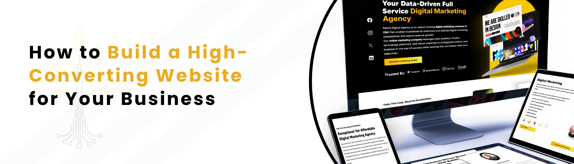
At Keach, we don’t just help you build a High-Converting Website. Our team specializes in Web Development USA, Website Design USA, and Conversion Rate Optimization, so your business never misses an opportunity.
Contact Keach today and let’s build something powerful together.